MultiWidgets::Widget is the basic building block of Cornerstone applications. All visual and interactive elements are inherited from the Widget class.
MultiWidgets namespace contains many off-the-self widgets to use, like ImageWidget, VideoWidget, TextWidget, etc. You can easily create simple applications by combining these basic components.
In case more customization is required, the basic widgets can be extended by inheritance. The most common situation where creating a custom widget is required is when either the input handling or rendering must be customized.
Cornerstone manages the life-time of widgets using smart pointers. The Radiant::IntrusivePtr class is used throughout the SDK. This pointer has a type definition for widgets, called MultiWidgets::WidgetPtr.
Because of the smart pointers, new widget instances must be created using a factory method called MultiWidgets::create():
The smart pointers will automatically release the memory reserved for each widget when the reference count for the widget falls to zero.
Widgets can not be instantiated by using new or be freed with delete.

Widgets form a tree hierarchy. Each widget can have one parent widget and one or more child widgets. The key features of the widget hierarchy are:
Cornerstone applications own the root nodes of the widget hierarchy. Use MultiWidgets::Application::mainLayer() to access the main-layer root widget. A widget must be part of the widget hierarchy for it to be displayed, updated, etc.
To make a widget the child widget of another can be done using the MultiWidgets::Widget::addChild() method of the parent widget. Because the widget hierarchy is a tree hierarchy, the child widget will be removed from its old parent, if it has any, before adding it as the child of the new parent.
The HelloWorldExample demonstrates how to create a simple Application and add a few widgets to the scene.
Nothing enforces child widgets to actually stay within the boundaries of their parent widgets. It is perfectly valid to have a child widget completely outside the boundaries of its parent widget.

The default origin of the widget coordinate-space is the top-left corner. The x-coordinates increases to right and y-coordinate to down. It is possible to define the widget origin also manually by using MultiWidgets::Widget::setOrigin().
The rotation of a widget is given as radians. Helper functions to convert between degrees and radians can be found in Nimble namespace (Nimble::Math::degToRad(), Nimble::Math::radToDeg()). Remember that widget coordinates are relative to parent coordinates, not to screen coordinates. This means that parent's rotation is automatically added to all children, as is its scale and translation.
The z-order of widgets with the same parent, or sibling widgets, is defined by the widget's depth. Widgets with lower depth are shown below the widgets with higher depth. Widgets with negative depth are drawn behind their parent widget. Note that depth is also inherited, meaning if B is under A, also all the A's children are above B, no matter what their depth value is. Depth can be adjusted with MultiWidgets::Widget::setDepth() method.
By default, when a widget receives user input, it is automatically raised to front, unless its depth is locked using the flag LOCK_DEPTH.
The widget depth also determines the processing order of siblings:
By default, the standard widgets implement the basic multi-touch gestures. These include:
Cornerstone has a concept of tracked objects. This is an abstraction to any object we can track, like fingers, hands, pens, markers, etc. Widgets can grab tracked objects that are used to interact with it. This is the default behaviour. If a tracked object, say, a finger, is grabbed by a widget. No other widget can get interaction from it until the original widget ungrabs the finger. As input is processed front-to-back, usually the top-most widget will grab the finger and other widgets behind it will not get input from that finger. If the finger is not grabbed by the widget, then other widgets behind it can also get input from the same finger.
The grabbing behaviour of widgets can be controlled with the MultiWidgets::InputGrabber::GrabFlags.
Much of the behaviour how widgets react to input can be controlled with MultiWidgets::Widget::InputFlags. These flags can be combined in any way to create different behaviours.
To modify the current flags you can use methods:
The following code snippet creates a widget that can only be rotated and moved in X-direction. It can not be scaled or moved in Y-direction.
See our InputFlags-example for more info.
One of the reasons for creating your own widget would be to create custom handlers for user input. There are two ways you can do this in Cornerstone: either by overloading some of the Widget class methods, or by using the event system provided by the framework. Both of these provide pretty much the same functionality. Here we demonstrate the first option, for more about events see section Event system.
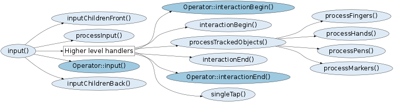
Widget has multiple of protected virtual member functions that can be overloaded for custom handling. Most generic function is the processInput() which is called at every frame whether there is input or not. There are also many higher-level function that get invoked as a result of user input:
Custom input handling can also be done using Operators and overriding their input()-method.
Following image shows the rough call graph for the callbacks. Related events are sent right after the callback. What is important to notice that the higher-level callbacks are NOT invoked unless there is related interaction with the widget, e.g. processMarkers() is never called unless there is a marker on the widget. If such behaviour is required, then it is adviced to override the MultiWidgets::Widget::processInput() function which is called periodically.
Notice that callbacks also require that the widget is visible and nested inside the Applications widget hierarchy. Also the input-flags are checked before calling some of the callbacks, e.g. Operator::input is invoked only if related INPUT_OPERATORS flag is enabled.
For more about input handling see CustomInputWidgetExample
Widgets in Cornerstone support a feature called grabbing. Basically, widgets can reserve, or grab, tracked objects.
Grabbing behaviour can be controlled using the MultiWidgets::InputGrabber class API. Each MultiWidgets::Widget has an instance of MultiWidgets::InputGrabber that can be accessed using the MultiWidgets::Widget::inputGrabber function. Grabbing behaviour can be controlled per tracked object type.
When a widget grabs certain tracked objects, it means that the grabbed tracked object can not affect other widgets. For example, if a finger has been grabbed by widget A and then moved over widget B, widget B will not get input from the grabbed finger.
Hand-grabbing is a special case for tracked objects. If a widget grabs hands, it will reserve all fingers from that hand even if some of the fingers are outside the widget.
Sometimes it is useful to update widget state based on time instead of input events. Instead of using some timer-classes you can do this easily and thread-safely by overloading method update(const FrameInfo &). Application calls this method periodically after the input methods and before the render methods (see Application basic main loop). The usual reason to overload this function is to update the widget state, update animations, etc.
Sequental update calls should happen at fixed time interval, but it cannot be guaranteed fully. That is why a reference to MultiWidgets::FrameInfo is provided as an argument.
Note that you shouldn't do any heavy processing work inside the update method because that causes the entire app to slow down.
By default, widgets are visualized as rectangles. This can be changed by overloading the widget rendering functions. This way you can create any shape widget as you like, e.g. circle, animated spline, 3D objects, etc..
Notice however that Cornerstone rendering is multi-threaded! That means that multiple render calls may execute at the same time. Therefore you have to make sure your rendering code is thread-safe. This is also the reason why rendering methods are declared as consts, so you can not modify the widget state within them.
A more comprehensive tutorial into CornerStones rendering can be found in the Rendering Engine section.
Drawing is done using the RenderContext interface and it's utility functions.
Notice that changing the widget's shape from rectangle to a circle (or something else) does not affect the input events coming to the widget. Widget receives the user inputs when user clicks within widgets bounds, and these bounds have default shape of a rectangle. This behaviour can however be changed by overloading method isInside().
See more about creating custom-shaped widget in our CustomRenderWidget-example.
In most cases it is not required to derive your own Widget-class just to enhance the widget's appearance. Cornerstone has excellent support for decorating widgets with CSS attributes. These include, for example, color, background image, border-color, location, etc. There are also many effects for text widgets like adding shadow, stroke, etc. All this is achived by adjusting a simple standard CSS text file.
Cornerstones CSS support is explained more thoroughly in section CSS. There are also several examples which show you more about CSS. You can start with these: ButtonExample, EventsExample, TextRenderingExample, etc..
Many times widgets require some extra behaviour that would require overloading some of the widgets methods. Instead of creating new features by deriving (or adding them to parent class) Cornerstone also supports the use of Operators to add functionality to any existing widget.
Animating widget attributes (scale, rotation, location, etc.) is also a common task that is confronted quite often. Cornerstone provides ways to achieve rich animations in an easy way. More about animations can be found from the Animation section.

