Cascading Style Sheets, CSS for short, is a style sheet language which uses simple semantics to describe the appearance of content.
It is commonly used to define the appearance of web pages with HTML and JavaScript.
CSS in Cornerstone can be used to define the values of Attributes. Any attribute value can be defined via CSS and not just attributes related to the appearance of widgets. The collection of CSS rules, usually defined in a CSS file, is called the style of a widget.
Cornerstone implements its own CSS parser and CSS engine:
CSS-related classes can be found in Stylish namespace, but it is typically not necessary to use these classes directly. Most of the logic is already integrated into the MultiWidgets::Widget class, so usually it is enough to just define some extra CSS selectors for widgets when needed.
We recommend the practice of defining your application structure with C++/JavaScript and then using CSS to define their attributes. This approach has several benefits over defining the attribute values in source code:
A prerequisite for using CSS in Cornerstone is a basic understanding of CSS and its syntax. Many excellent tutorials can be found online, e.g. www.w3schools.com
You can get a basic idea just by reading this document and looking at our examples, but understanding the following basic principles in CSS will be beneficial:
There are two ways to apply a style defined in a CSS file to an application:
Cornerstone CSS engine supports @import tag to split your CSS content into many files if necessary. This might be handy for creating simple reusable style files, e.g. one file for text effects, one file for your widget plugins, etc.
All widgets in Cornerstone have the CSS type selector that matches the class name without namespace. For example, MultiWidgets::Widget has a type selector Widget, MultiWidgets::ImageWidget has a type selector ImageWidget, etc.
Below is a simple example of basic style for a widget. It also demonstrates the CSS Box Model that Cornerstone implements.
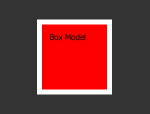
The image above is the result of a single instance of MultiWidgets::TextWidget:
and some CSS applied to it:
In the example above, the style is applied to all TextWidgets in the application.
It is also possible to change any widget attributes using CSS. We can modify the previous example to change some of the TextWidget's attributes using an id selector:
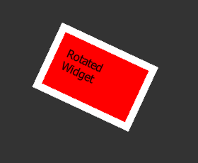
In the picture above, we first apply a CSS id to our TextWidget instance in C++ code:
Then we apply a new set of CSS rules in addition to the previous rules, but this time so that they match only the MyAttributes CSS id:
Here the rotation, size, input-motion and text are not standard CSS attributes anymore. Instead they reference internal attributes of the MultiWidgets::TextWidget class. The same result could have been done using C++ functions like setRotation(float) etc.
Note that in the last case the !important flag is required, because the value set in C++ code is above the CSS-style file in the Attributes priority layer (See Attribute Layers). This is one of the reasons why it is convienient to keep as much of the attribute initializations in the CSS, instead of hard-coding it into the application.
The !important flag is also required after user has interacted with the widget. User interaction causes the attribute values to be modified in the User layer by C++ code.
All widgets in Cornerstone have the CSS type selector that matches the class name without namespace. For example, MultiWidgets::Widget has a type selector Widget, MultiWidgets::ImageWidget has a type selector ImageWidget, etc.
Widget can be a part of many classes but it can have only one id and type. Cornerstone does not enforce ids to be unique, so multiple widgets can have the same id, but this can be considered as a misuse of the selector. In these cases you should use the class selector instead.
Here is a short example of these basic selectors:
Other CSS 2.1 selectors supported by Cornerstone:
Child of selector can be used to reference widgets that have been added to another widget using the Widget::addChild method.
Child of selector only matches widget's direct children, if you want to match to all descendants, including children, grandchildren etc, you can use Descendant selector:
Pseudo-class selectors can be used to react to some state-changes inside widgets. You can define your own pseudo classes with Stylish::Styleable::setPseudoClass.
Universal selector is the simplest selector, and mainly used for debugging. Universal selector will match all widgets.
Different kind of selectors can be combined:
The following CSS pseudo classes are built-in to Cornerstone.
MultiWidgets::BaseMediaWidget (applies to MultiWidgets::ImageWidget, MultiWidgets::VideoWidget, MultiWidgets::ImageMovieWidget):
Cornerstone automatically re-applies styles when:
Cornerstone tracks dependencies between relative attributes using attribute listeners. When an attribute value is changed, any attributes that depend on it are updated.
You can learn more by checking these following examples:

