ButtonExample shows how to easily create a simple press button which reacts to user input. In this example the button is used to toggle the visibility of another widget.
The button is created using a standard MultiWidgets::Widget and defining two background images for it. We use one background image for the widget in its normal state and another image in its active state. The built-in active pseudo-state for every widget is automatically set when there is any user interaction on the widget. It is also automatically un-set when the interaction ends. This allows us to implement basic effects using just CSS alone without the need for any C++ code.
The CSS file itself is very simple, containing two CSS selectors. First one is a general class selector for our button. The second one uses the active selector to override the background-image attribute when user clicks the button. We also use the CSS file to match the widget size to the image size and set the background-color to transparent.
We need to set the widget size manually to match the image size when using the background-image. Defining a background-image for a MultiWidgets::Widget will not automatically resize the widget to the image size. In comparison, MultiWidgets::ImageWidget will automatically resize to the size of the image defined in its source attribute.
Next we create our button. We use normal MultiWidgets::Widget class and add the CSS class we defined earlier. We want to disable the button movement by adjusting input flags, but we want to keep the single-taps and the grabs to make sure our button receives all the necessary input. In this case, we don't want the user to be able to drag the button away from its defined location.
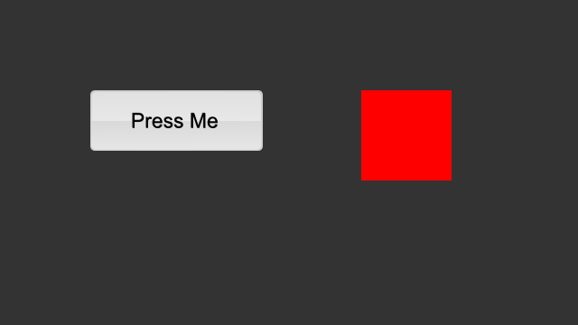
Usually we like the button press to do something. This is achieved by adding an event handler to listen the single-tap event. We use a lambda function as our callback handler, which simply shows or hides our target widget.
The full source code for the example is listed below:

