All Classes Namespaces Functions Variables Typedefs Enumerations Enumerator Friends Pages
CustomRenderWidgetExample.cpp

The CustomInputWidgetExample.cpp demonstrated how to add custom input handling in a widget. In this tutorial, we will demonstrate how to override the default rectangular shape of a widget by implementing custom rendering. The end result will be a round, donut-shaped widget with a hole in the middle. We will also override the containment test for the widget so that fingers not actually touching the displayed shape of the widget will have no effect on it.

CustomRenderWidget-screenshot.png
Screenshot of the CustomRenderWidget example

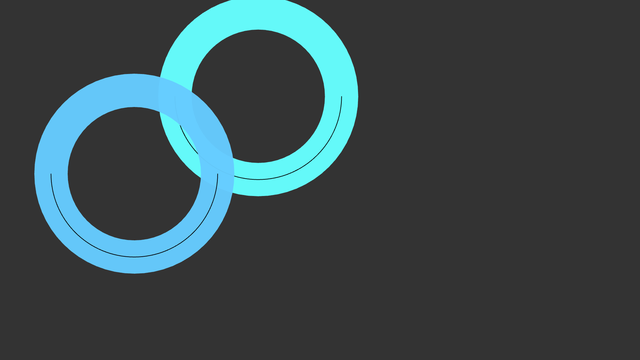
First, we declare our custom widget which we will call DonutWidget. It will override two important functions: renderContent and isInside. The renderContent function is fairly simple. We draw our donut as a circle with some thickness. Inside the circle we draw an arc to be able to visualize rotations. The circle is actually drawn as an arc from zero to two-pi radians:

void DonutWidget::renderBackground(Luminous::RenderContext & r) const
{
// Compute the center of the widget in local coordinates
Nimble::Vector2 center = 0.5f * size().toVector();
// Compute the radius of the donut in local coordinates
float radius = 0.5f * width();
s.setStrokeColor(backgroundColor());
s.setStrokeWidth(m_thickness);
// This functions draws the main circle
r.drawArc(center, radius, 0.f, Nimble::Math::TWO_PI, s, 64);
s.setStrokeColor(m_arcColor);
// Lets draw an thin arc inside the circle. This adds to the graphical
// feeling and without it users would not see when they rotate the widget.
r.drawArc(center, radius, 0.0f, Nimble::Math::PI, s, 64);
}

Now the inner arc of our widget intersects the border of default bounding rectangle in three points: (0, 0.5*width()), 0.5*(width(), width()) and (width(), 0.5*width()). From this, it is easy to see that parts of the donut are not contained in the bounding rectangle (namely outer edge of the donut). To alleviate this we need to override boundingRect-function that returns the correct axis aligned bounding box for the widget. Otherwise our widget would be incorrectly clippend near the borders of window.

Nimble::Rect DonutWidget::boundingRect() const
{
Nimble::Vector2f low(-m_thickness, -m_thickness);
Nimble::Vector2f hi(width() + m_thickness, width() + m_thickness);
return Nimble::Rect(low, hi);
}

Note that overriden versions of isInside and boundingRect do not take the borders of the widget to account. If our widget would have thick enough borders it would be again incorrectly clipped.

Since our widget is no longer a rectangle, we want to override the input handling so that touches only on the donut will affect the widget. We can do this by overriding the isInside function which is used by the input handling to determine whether fingers are touching a widget or not. The implementation for the isInside is simple: we just calculate the inner and outer radius of our donut and compare if the distance from the given point to the center of our widget is between the two radii. If the distance is not between our two radii, the point does not hit the donut.

bool DonutWidget::isInside(Nimble::Vector2 v) const
{
// Compute the inner and outer radii of the donut
float outerRadius = 0.5f * width() + m_thickness;
float innerRadius = 0.5f * width() - m_thickness;
// Compute the center of the circles
Nimble::Vector2 center = 0.5f * size().toVector();
// Compute the distance of the input point from the center
float distance = (v - center).length();
// If the distance is smaller than the out radius and larger than the inner
// radius the point is inside our donut
return (distance > innerRadius && distance < outerRadius);
}

DonutWidget.hpp:

/* Copyright (C) 2007-2013 Multi Touch Oy, Finland, http://www.multitaction.com
*
* This file is part of MultiTouch Cornerstone.
*
* All rights reserved. You may use this file only for purposes for which you
* have a specific, written permission from Multi Touch Oy.
*
*/
#ifndef DONUTWIDGET_DONUT_WIDGET_HPP
#define DONUTWIDGET_DONUT_WIDGET_HPP
#include <MultiWidgets/Widget.hpp>
namespace Examples
{
class DonutWidget : public MultiWidgets::Widget
{
public:
DonutWidget();
virtual void renderBackground(Luminous::RenderContext & r) const OVERRIDE;
virtual bool isInside(Nimble::Vector2 v) const OVERRIDE;
void setThickness(float thickness) { m_thickness = thickness; }
virtual Nimble::Rect boundingRect() const OVERRIDE;
private:
// We draw an arc inside the donut with this color
};
}
#endif

DonutWidget.cpp:

/* Copyright (C) 2007-2013 Multi Touch Oy, Finland, http://www.multitaction.com
*
* This file is part of MultiTouch Cornerstone.
*
* All rights reserved. You may use this file only for purposes for which you
* have a specific, written permission from Multi Touch Oy.
*
*/
#include "DonutWidget.hpp"
namespace Examples
{
DonutWidget::DonutWidget()
: Widget(),
m_thickness(this, "thickness", 25),
m_arcColor(this, "arc-color", "#000000")
{}
void DonutWidget::renderBackground(Luminous::RenderContext & r) const
{
// Compute the center of the widget in local coordinates
Nimble::Vector2 center = 0.5f * size().toVector();
// Compute the radius of the donut in local coordinates
float radius = 0.5f * width();
s.setStrokeColor(backgroundColor());
s.setStrokeWidth(m_thickness);
// This functions draws the main circle
r.drawArc(center, radius, 0.f, Nimble::Math::TWO_PI, s, 64);
s.setStrokeColor(m_arcColor);
// Lets draw an thin arc inside the circle. This adds to the graphical
// feeling and without it users would not see when they rotate the widget.
r.drawArc(center, radius, 0.0f, Nimble::Math::PI, s, 64);
}
// We must override the isInside function since our widget is no longer
// rectangle-shaped. The incoming vector is already in the local coordinate
// system.
bool DonutWidget::isInside(Nimble::Vector2 v) const
{
// Compute the inner and outer radii of the donut
float outerRadius = 0.5f * width() + m_thickness;
float innerRadius = 0.5f * width() - m_thickness;
// Compute the center of the circles
Nimble::Vector2 center = 0.5f * size().toVector();
// Compute the distance of the input point from the center
float distance = (v - center).length();
// If the distance is smaller than the out radius and larger than the inner
// radius the point is inside our donut
return (distance > innerRadius && distance < outerRadius);
}
// Function that calculates bounding rectangle of the widget needs to be
// overriden as well because we are rendering outside of the default
// bounding rectangle that is defined by vertices located in (0,0)
// and (width(), height()).
Nimble::Rect DonutWidget::boundingRect() const
{
Nimble::Vector2f low(-m_thickness, -m_thickness);
Nimble::Vector2f hi(width() + m_thickness, width() + m_thickness);
return Nimble::Rect(low, hi);
}
}

With our DonutWidget defined, we create a simple application to put two instances of our custom widgets on screen:

/* Copyright (C) 2007-2013 Multi Touch Oy, Finland, http://www.multitaction.com
*
* This file is part of MultiTouch Cornerstone.
*
* All rights reserved. You may use this file only for purposes for which you
* have a specific, written permission from Multi Touch Oy.
*
*/
#include "DonutWidget.hpp"
#include <MultiWidgets/Application.hpp>
int main(int argc, char ** argv)
{
if(!app.init(argc, argv))
return 1;
// Create two custom widgets
for(int i = 0; i < 2; i++) {
auto w = MultiWidgets::create<Examples::DonutWidget>();
// Set widget parameters:
w->setThickness(50);
w->setSize(Nimble::SizeF(500, 200));
w->setLocation(Nimble::Vector2(i * 50, i * 50));
// Create random colors for the widgets:
w->setBackgroundColor(Nimble::Vector4(0.4f, 1.0f - i * 0.2f, 1.0f, 0.97f));
// Add the widget to the scene:
app.mainLayer()->addChild(w);
}
// Run the application:
return app.run();
}