|
MT Showcase SDK
|
|
MT Showcase SDK
|
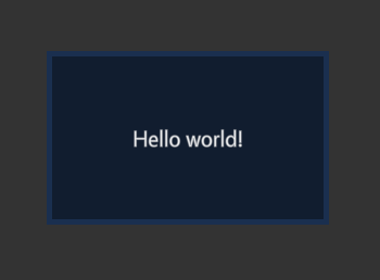
This tutorial teaches you the basics of developing plugins for MT Showcase. It adds a simple new widget with a single editable attribute to Showcase.
We will create a new custom widget and add it as a component to Showcase. First include the necessary header files. This will be a widget component, so include Showcase::WidgetComponent. We'll use TextWidget from Cornerstone as the base of our new widget, so include TextWidget as well:
Then create a new widget class by inheriting from TextWidget. For this example we'll just set a custom CSS class for this widget so we can customize its look.
We use the convenient SHOWCASE_WIDGET_COMPONENT macro to define this widget as a widget component in Showcase. It will use the basic Showcase::WidgetComponent as the component class, and Showcase::WidgetInstance as the instance class. When an instance of this component is created, it will create a HelloPluginsWidget as its widget. This component can be referenced with component name hello-plugins.
Next we create the HelloPlugins package. Create a directory package under the HelloPlugins directory. We want to apply some custom CSS, so create a data folder, and add a hello-plugins.css file under it. Define the default text and looks for the new widget:
We can also add a screenshot and description to be displayed in the Editor for this component. So add a description.html and hello-plugins.png in the package directory.
Description.html:
Next we define our component. Create a hello-plugins.schema file under the package directory. We will allow adding this widget in the main layer in a Showcase structure, so add the role main to it. We will also want to make the text editable. We inherited from TextWidget, which has an attribute text that controls the text the widget displays. We will expose this attribute in the Editor by defining the attribute in the schema. Note that widgets have several attributes by default, but only attributes defined in the schema are visible and editable in the Editor. You can add your own attributes to your widgets, but for this example we just use the default TextWidget attributes.
Finally we create a package file that ties everything together, call it hello-plugins.package. We define a name and version for our package, and the single component it adds. We leave required Showcase version as SHOWCASE_VERSION for convenience, so it will work with any version of Showcase without updating the package file. Note that the plugin must still be recompiled when Showcase is updated.
Add the compiled library under the package directory as well. The final structure of the package directory is
Full source code of HelloPlugins.cpp:
 1.8.3.1
