This tutorial teaches you how to use content sets in MT Showcase plugins. It adds a new widget with a content set to Showcase.
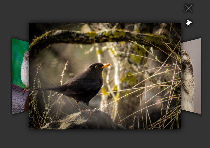
Screenshot of the ContentExample widget. Photos by Phil Fiddyment
We will create a new custom widget and add it as a component to Showcase. First include the necessary header files. This will be a widget component, so include Showcase::WidgetComponent. We'll use ItemFlowWidget from Cornerstone as the base of our new widget, so include ItemFlowWidget as well. Finally we'll be using Showcase's content system, so include Showcase::ContentNode.
#include <Showcase/ContentNode.hpp>
#include <Showcase/WidgetComponent.hpp>
#include <MultiWidgets/ItemFlowWidget.hpp>
Then create a new widget class, this time just inherit from plain Widget. We'll add an ItemFlowWidget as a child of our widget so we can handle input rules more easily, the flow will only receive input while widget is pinned. We'll also need methods to add and remove widgets as content.
class ContentExampleWidget : public MultiWidgets::Widget
{
public:
ContentExampleWidget();
void addItem(MultiWidgets::WidgetPtr item);
void removeItem(MultiWidgets::WidgetPtr item);
private:
MultiWidgets::ItemFlowWidgetPtr m_flow;
};
INTRUSIVE_PTR_TYPEDEF(ContentExampleWidget);
We create a flow as a child of this widget in the constructor, and set a custom CSS class. We'll implement adding and removing content widgets as simply adding and removing them from the flow.
ContentExampleWidget::ContentExampleWidget()
: m_flow(MultiWidgets::create<MultiWidgets::ItemFlowWidget>(this))
{
addCSSClass("content-example-widget");
}
void ContentExampleWidget::addItem(MultiWidgets::WidgetPtr item)
{
m_flow->addItem(item);
}
void ContentExampleWidget::removeItem(MultiWidgets::WidgetPtr item)
{
m_flow->removeItem(item);
}
Since we want to handle content, we'll need our own custom widget instance. Create a new instance class and inherit from Showcase::WidgetInstance. Override the virtual funtions contentNodeFound and contentNodeLost which are called by Showcase engine when the instance's creator component has found or lost a content node. We will create a widget for each content node child and add it to our flow widget.
We'll also need easy access to our widget, and a map between content nodes and created widgets so we can remove the widgets when content is removed. Take a weak pointer to the widget to avoid memory leaks, as the instance stays alive as long as its widget is alive.
{
public:
ContentExampleWidgetInstance(Showcase::ComponentPtr comp,
MultiWidgets::WidgetPtr instance);
std::shared_ptr<Showcase::ContentNode> parent) override;
std::shared_ptr<Showcase::ContentNode> parent) override;
private:
ContentExampleWidgetWeakPtr m_contentWidget;
std::map<std::shared_ptr<Showcase::ContentNode>, MultiWidgets::WidgetWeakPtr> m_items;
};
We need to call the constructor of WidgetInstance from our constructor, and we'll store a pointer to our widget. Note that we're storing a weak pointer, instance should never take a strong pointer to its widget to avoid memory leaks. Instance is alive as long as its widget is alive, so it should not keep the widget alive.
ContentExampleWidgetInstance::ContentExampleWidgetInstance(Showcase::ComponentPtr comp,
MultiWidgets::WidgetPtr instance)
: WidgetInstance(comp, instance)
{
auto content = instance.dynamic_pointer_cast<ContentExampleWidget>();
m_contentWidget = content;
}
contentNodeFound is called when a new node is found in this component's content graph. Content can have slots similar to components, in our case the content will have a slot content-viewer. We can request a widget instance matching a given slot name with Showcase::ContentNode::createWidgetInstance. If a component is assigned to that slot, the content node will create a new instance of the component and returns the matching widget. We'll add that widget to our widget, and store it in a map for later. Note that contentNodeFound is called from a background thread, we'll add the widget to hierarchy in main thread by using Valuable::Node::invokeAfterUpdate.
void ContentExampleWidgetInstance::contentNodeFound(std::shared_ptr<Showcase::ContentNode> node,
std::shared_ptr<Showcase::ContentNode>)
{
auto content = m_contentWidget.lock();
if (!content)
return;
auto instanceWidget = node->createWidgetInstance("content-viewer", content->id());
if (instanceWidget) {
Valuable::Node::invokeAfterUpdate([content, instanceWidget] {
content->addItem(instanceWidget);
});
m_items[node] = instanceWidget;
}
}
contentNodeFound is called when a new node is removed from the content graph. We'll check if we had a widget created from this content, and if so, remove it from our widget. Again, we'll do the removing later in main thread.
void ContentExampleWidgetInstance::contentNodeLost(std::shared_ptr<Showcase::ContentNode> node,
std::shared_ptr<Showcase::ContentNode>)
{
auto content = m_contentWidget.lock();
if (!content)
return;
auto it = m_items.find(node);
if (it != m_items.end()) {
if (auto instanceWidget = it->second.lock()) {
Valuable::Node::invokeAfterUpdate([content, instanceWidget] {
content->removeItem(instanceWidget);
});
}
m_items.erase(it);
}
}
Now that we have our widget and instance, we can use the SHOWCASE_CUSTOM_WIDGET_INSTANCE_COMPONENT macro to register them.
SHOWCASE_CUSTOM_WIDGET_INSTANCE_COMPONENT("content-example-widget", ContentExampleWidget, ContentExampleWidgetInstance)
Next we create the ContentExample package. Create a directory package under the ContentExample directory. We want to apply some custom CSS, so create a data folder, and add a content-example.css file under it. We'll define the looks for our widget and its flow widget. We'll only enable input on the flow while the widget is pinned. We'll also just want to display the content widgets, so we'll hide their decorations and toolbars, and disable some extra behaviours on them.
.content-example-widget {
size: 600px 600px;
background: transparent;
}
.showcase-layer > .content-example-widget {
remove-outside-parent: true;
}
.content-example-widget > ItemFlowWidget {
size: 50% 50%;
input-flags: none;
location: 50% 50%;
origin: 50% 50%;
centersizerel: 2 2;
separation: 0.6;
lock-depth: true;
exclude-bounds: true;
}
.content-example-widget.showcase-pinned-widget > ItemFlowWidget {
input-flags: default;
input-motion: false;
}
.content-example-widget > ItemFlowWidget .decoration,
.content-example-widget > ItemFlowWidget .toolbar {
display: none !important;
}
.content-example-widget > ItemFlowWidget > * {
stay-inside-parent-with-children: false !important;
rotate-towards-hand: false !important;
open-in-fullscreen: false !important;
}
We can also add a screenshot and description to be displayed in the Editor for this component. So add a description.html and content-example.png in the package directory.
Next we define our component. Create a content-example.schema file under the package directory. We will allow adding this widget in the main layer in a Showcase structure, so add the role main to it. We want to enable some extra attributes for this widget, like setting its location and adding a toolbar. You can inherit other schemas to quickly add common properties to your schemas. We inherit widget.schema to add location and scale to editable attributes, and with-toolbar.schema to enable adding a toolbar.
Then we just need to add a content set. For that we define a slot with type graph. We don't want any functional widgets like clouds or games in our flow, so we'll limit the content node types to assets and urls. Finally we need the widget that will display the content, a content-viewer. We add a node attribute to our content set with type ui-component for setting a content viewer. This is a special attribute; if it's not set in content set editor, it's automatically pulled from the application's theme based on the type of the node. Note that if we allowed widget nodes in our content set, we'd need another node attribute ui-node to pick up the defined widget.
{
"includes" : [ "showcase-package:widget.schema",
"showcase-package:custom-schemas/with-toolbar.schema" ],
"roles" : [ "main" ],
"slots" : {
"content" : {
"type" : "graph",
"min" : 1,
"max" : 1,
"supported-types" : [ "asset", "url", "tweet" ],
"node-attributes" : [
{
"attribute-name" : "content-viewer",
"type" : "ui-component",
"component-role" : "content-viewer",
"ui-name" : "Content viewer",
"description" : "Which viewer widget displays the selected content.",
"in-theme" : false,
"required" : false
}
]
}
}
}
Next we create a package file that ties everything together, call it content-example.package. We define a name and version for our package, and the single component it adds. We leave required Showcase version as SHOWCASE_VERSION for convenience, so it will work with any version of Showcase without updating the package file. Note that the plugin must still be recompiled when Showcase is updated.
{
"name" : "Content example",
"package-version" : "1.0.0",
"libraries" : [ "ContentExample-SHOWCASE_VERSION" ],
"required-showcase-version" : "SHOWCASE_VERSION",
"components" : {
"content-example-widget" : {
"type" : "ui",
"data-folders" : [ "data" ],
"css-files" : [ "content-example.css" ],
"schema" : "content-example.schema",
"description" : "description.html",
"ui-name" : "Content example"
}
}
}
Add the compiled library under the package directory as well. The final structure of the package directory is
package/
├── data
│ └── content-example.css
├── content-example.package
├── content-example.schema
├── description.html
├── content-example.png
└── libContentExample-[version].so
Full source code of ContentExampleWidget.cpp:
#include <Showcase/ContentNode.hpp>
#include <Showcase/WidgetComponent.hpp>
#include <MultiWidgets/ItemFlowWidget.hpp>
namespace ShowcaseExamples {
class ContentExampleWidget : public MultiWidgets::Widget
{
public:
ContentExampleWidget();
void addItem(MultiWidgets::WidgetPtr item);
void removeItem(MultiWidgets::WidgetPtr item);
private:
MultiWidgets::ItemFlowWidgetPtr m_flow;
};
INTRUSIVE_PTR_TYPEDEF(ContentExampleWidget);
{
public:
ContentExampleWidgetInstance(Showcase::ComponentPtr comp,
MultiWidgets::WidgetPtr instance);
std::shared_ptr<Showcase::ContentNode> parent) override;
std::shared_ptr<Showcase::ContentNode> parent) override;
private:
ContentExampleWidgetWeakPtr m_contentWidget;
std::map<std::shared_ptr<Showcase::ContentNode>, MultiWidgets::WidgetWeakPtr> m_items;
};
ContentExampleWidget::ContentExampleWidget()
: m_flow(MultiWidgets::create<MultiWidgets::ItemFlowWidget>(this))
{
addCSSClass("content-example-widget");
}
void ContentExampleWidget::addItem(MultiWidgets::WidgetPtr item)
{
m_flow->addItem(item);
}
void ContentExampleWidget::removeItem(MultiWidgets::WidgetPtr item)
{
m_flow->removeItem(item);
}
ContentExampleWidgetInstance::ContentExampleWidgetInstance(Showcase::ComponentPtr comp,
MultiWidgets::WidgetPtr instance)
: WidgetInstance(comp, instance)
{
auto content = instance.dynamic_pointer_cast<ContentExampleWidget>();
m_contentWidget = content;
}
void ContentExampleWidgetInstance::contentNodeFound(std::shared_ptr<Showcase::ContentNode> node,
std::shared_ptr<Showcase::ContentNode>)
{
auto content = m_contentWidget.lock();
if (!content)
return;
auto instanceWidget = node->createWidgetInstance("content-viewer", content->id());
if (instanceWidget) {
Valuable::Node::invokeAfterUpdate([content, instanceWidget] {
content->addItem(instanceWidget);
});
m_items[node] = instanceWidget;
}
}
void ContentExampleWidgetInstance::contentNodeLost(std::shared_ptr<Showcase::ContentNode> node,
std::shared_ptr<Showcase::ContentNode>)
{
auto content = m_contentWidget.lock();
if (!content)
return;
auto it = m_items.find(node);
if (it != m_items.end()) {
if (auto instanceWidget = it->second.lock()) {
Valuable::Node::invokeAfterUpdate([content, instanceWidget] {
content->removeItem(instanceWidget);
});
}
m_items.erase(it);
}
}
SHOWCASE_CUSTOM_WIDGET_INSTANCE_COMPONENT("content-example-widget", ContentExampleWidget, ContentExampleWidgetInstance)
}
 1.8.3.1
